Fluous
Client: Fluous
Client Work: Branding, Print Design, Website Design
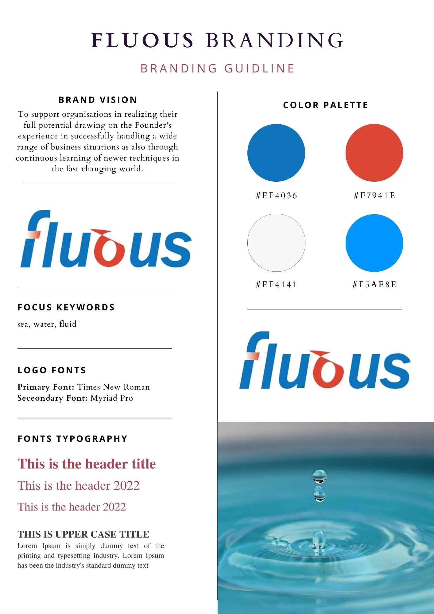
Fluous (pronounced FLU-US) is derived from the word FLUID. It signifies the ability to mold itself to its context and the ability to find its way – however difficult the terrain maybe! The visual identity was built with a typographical fluous that expresses two main points: firstly, the commitment to serve employee satisfaction without compromise of money and secondly, the ability to have an elevated all-encompassing view of the whole educational landscape.